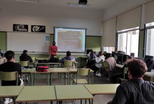

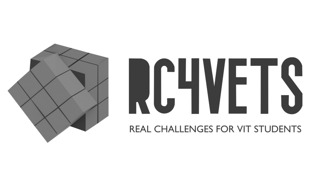
Cristian Javier Iglesias Fernández (@cristian.javier.iglesias) student of Technician in 3D Animations, Games and Interactive Environments studies at CIFP César Manrique has created the imagotype for “Real Challenge for Vocational Educational Training Students” Erasmus+ KA202 project.
Explanation
Based on the main objective is teamwork between students from different places to achieve the same goal. For this reason, the ‘Rubik’s cube’ is the perfect graphical representation; understanding that each cell is a student and all must move with unity and strategy.
It is precisely this link that is the most important in the composition: the students.
This implies that the standard measure for the formation of the logo, isotype and icon is the size of
a cell placed on a 2D plane.
As we can see in the previous image, the cube cell has two measures. The longest is used for the spacing between the icon and the project name, which is also made up of characters the size of the same, except the letters ‘V’ and ‘T’ to avoid a false asymmetry of the ‘Kerning’ or interlitered, both being enlarged by eye. Instead, the shorter is used for the spacing between title and subtitle.
The placement of the Rubik’s cube itself tries to express the term “project”, with the name of the mark on your right representing, within Western culture, advancement.
The colors used in the chromatic version are:
The main color is blue (4344E7). It is the characteristic color on the flag of UE followed by
yellow of its stars(FFD700). Finally, the green 5FE756, is the combination of both, thus reinforcing the aspect of unity, teamwork and collaboration.
Negative and chromatic versions for logotypes:

On the other site, the different versions of the imagotype:


We really like his creation and thanks the effort done by Cristian J. Iglesias Fernández and his teacher Alex Batista.